Netflix has revolutionised the way we watch our favourite TV-shows and movies. Besides the content itself, the very important part is the interface we use to find and watch the videos we like. Netflix has given us the freedom we very much enjoy. Remember the times when you had to be at home at a specific time to catch up with your favourite TV-show? Now you can basically watch it any time anywhere as long as you have a valid internet connection.
Netflix has been growing fast. According to Statista, in the second quarter of 2020, Netflix had 192.95 million paying streaming subscribers worldwide. Of these subscribers, 72.9 million were from the United States.
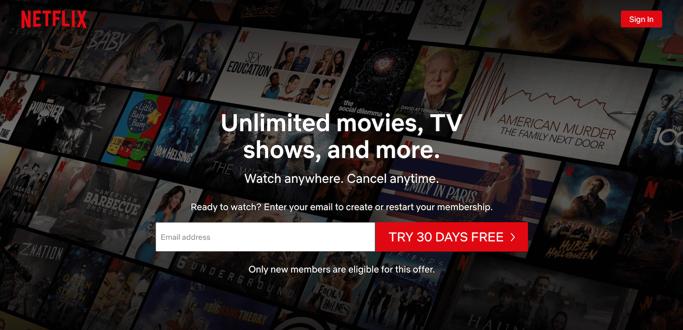
A vital tool to convert visitors into subscribers is Netflix’s landing page. We have seen many versions of it over the years as successful companies like Netflix know that you need to constantly experiment to hack the conversion rate.
In this article, we want to share with you some of the good approaches Netflix is using on their landing page. We have also used these strategies in some of our UX Estonia projects and have seen how these have brought results for our clients.
Don’t be afraid of using a larger font size
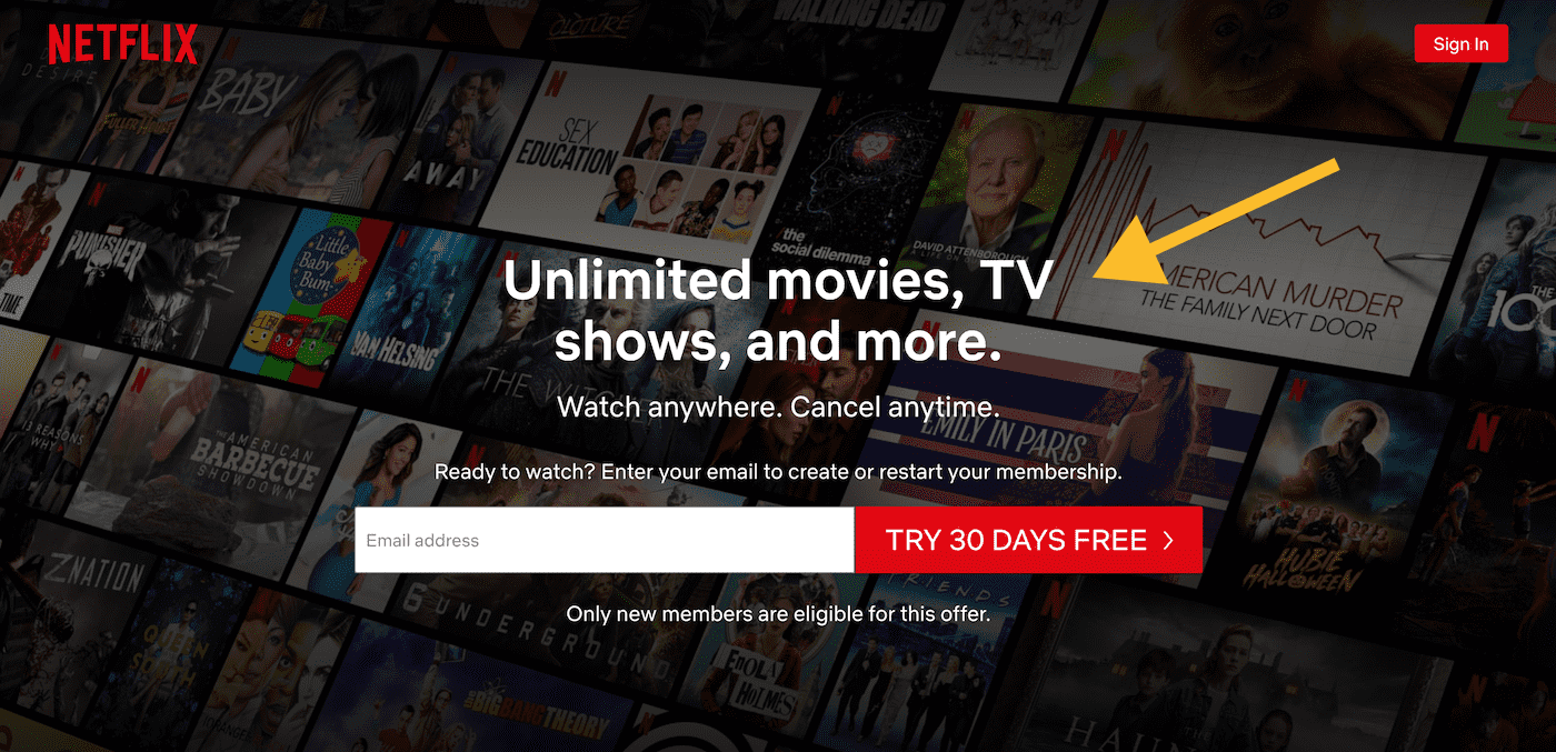
Make your value proposition and offer to stand out by using a larger font size. Increase the regular text size as well. Also, keep the copy short, if you want the user to read the texts on your page.
Have a concreate call to action
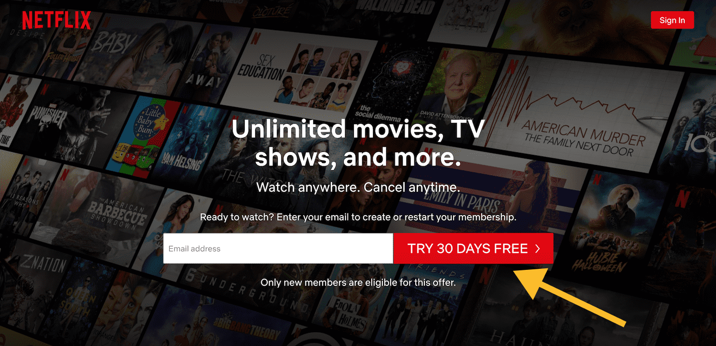
If you want users to sign up, make it as clear as possible. Have a well-defined action you want your visitors to take.
Focus on important features
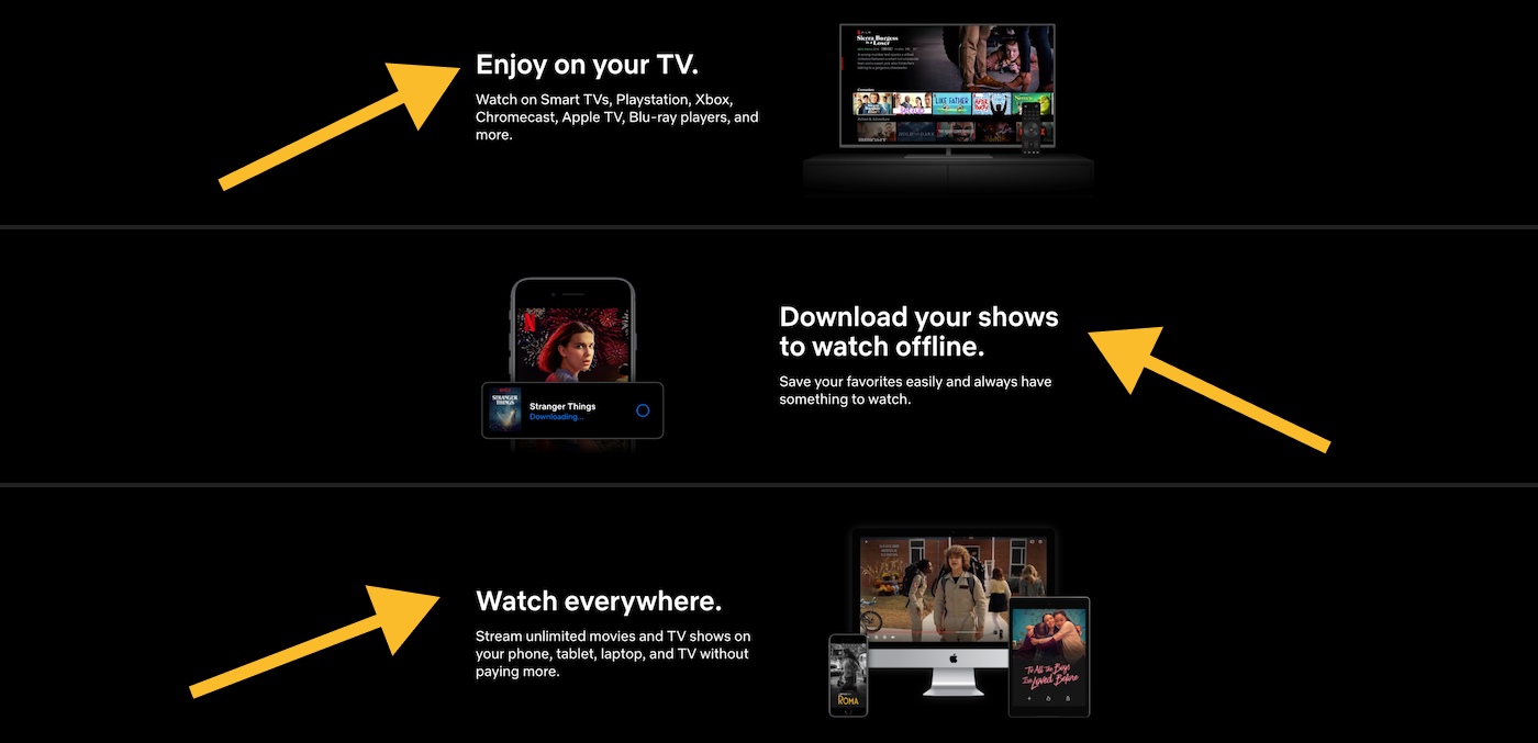
Don’t go into the feature-madness. Find out what are the 3 – 5 killer features of your product. Play those out well.
Stop hiding your FAQ
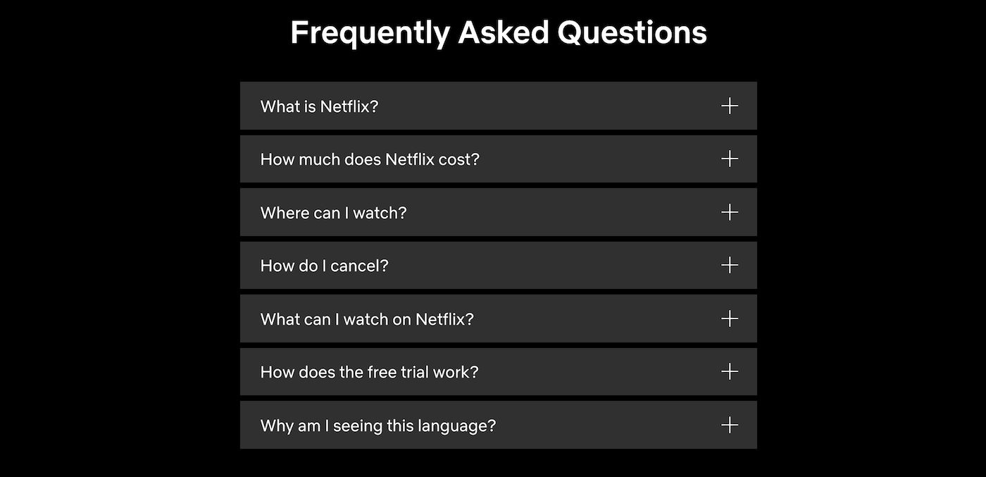
Users may have a lot of questions. Be clear and honest. Don’t hide cancellation and free trial terms.
Again, call to action
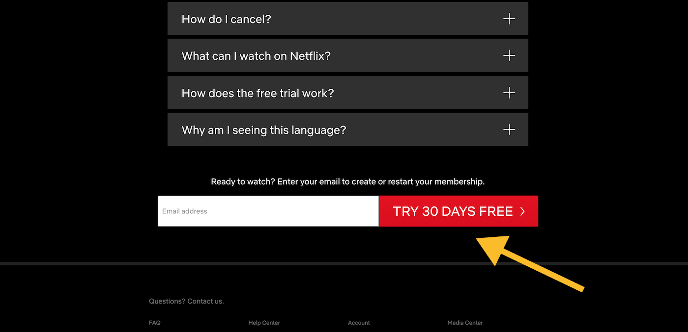
You might be surprised, but many sign-ups can come from the bottom of the page. This is because some of the users don’t sign-up unless they have got acquainted with the whole website. So, duplicating a sign-up possibility at the end of the page might give you the increase in user acquisition you are looking for.
Final thoughts…
As you know, when it comes to UX, very often there is no such thing as “one size fits all” solution. For example, Netflix is a well-known brand and doesn’t have to worry too much about establishing trust. But even if your business is well established, you still need to experiment like Netflix has done it over the years to learn how to do better constantly.
We hope this article has sparked some ideas that you would like to try out on your own landing page. If you need help with creating a converting landing page, feel free to reach out. To be in touch with UX news, trends and tips you are welcome to join our newsletter.