Interesting stories and useful insights on UX, UI, and AI are here for you again. As has become tradition lately, let’s start with a thematic meme. 🙃

User experience is a matter of perspective. When creating a successful product or service, we need to put ourselves in the user’s shoes, because what we see as designers or what the client orders may not hold the same value from the end user’s point of view.
That’s why it’s crucial to understand the end user’s perspective as early as possible and to test with the right target audience to identify critical issues that need to be fixed for creating the best customer experience.
1. What fonts do people prefer?
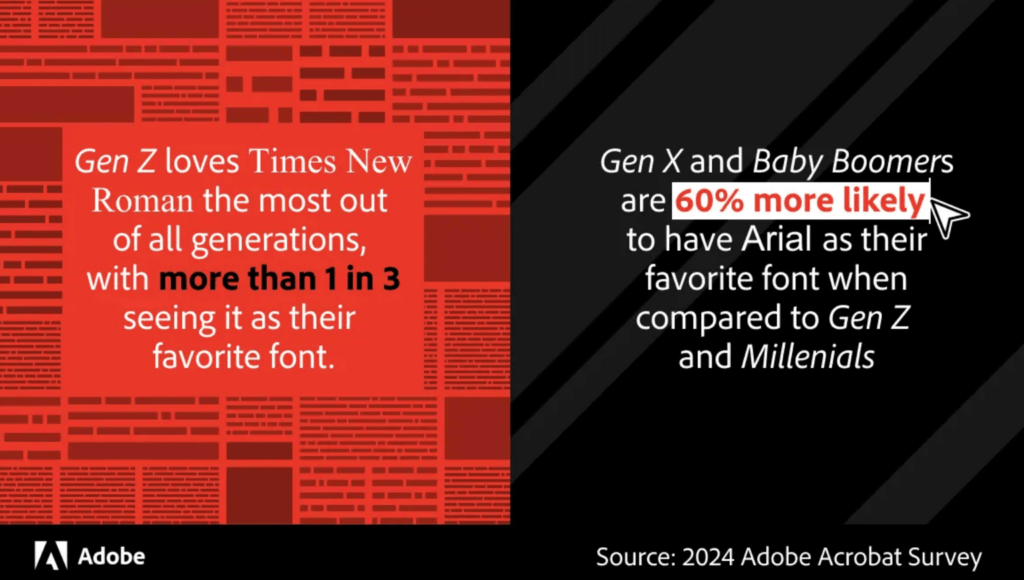
- Adobe conducted a study to understand how different fonts reflect personality traits.
- With the help of AI, emails were created for 13 different fonts.
- More than a quarter of respondents found that Courier New‘s personality was most similar to their writing style.
- Times New Roman and Arial, however, were most associated with the image of a trustworthy company.
- Over 10% of Americans considered Comic Sans to be the most embarrassing font.
2. What can we learn from the Midjourney customer experience survey?
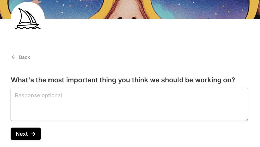
- Midjourney is one of the leading AI image generation software, and their team is quite active in seeking feedback from users.
- They are now planning next year’s road map, and in connection with this, they are conducting a survey among users.
- I liked two questions from their survey, which you might consider when conducting a design study of an existing service: 1. Ask the user, what is the most important thing our team should be working on? 2. What could we do to get more of your friends or acquaintances to use our service?
- The first question provides user priorities, and the second helps evaluate the bigger picture—getting ideas on how to motivate clients to recommend the service.
3. Are 90s design styles making a comeback?
- In the video, Megan Chan gives an overview of the repetition and intertwining of design trends.
- As one example, she mentions the Skeuomorphism style, which in the early 2000s imitated real-world objects to help users adapt to technology—think of the early iPhone user interfaces and icons.
- Later, the Flat design style emerged, which removed elements and shadows reminiscent of the “real” world, focusing more on minimalism and flatness. Microsoft was one of the leaders of this style with Windows Phone and Windows 8.
- Neumorphism, on the other hand, represents a blend of these two approaches.
4. Why is ALT text important?
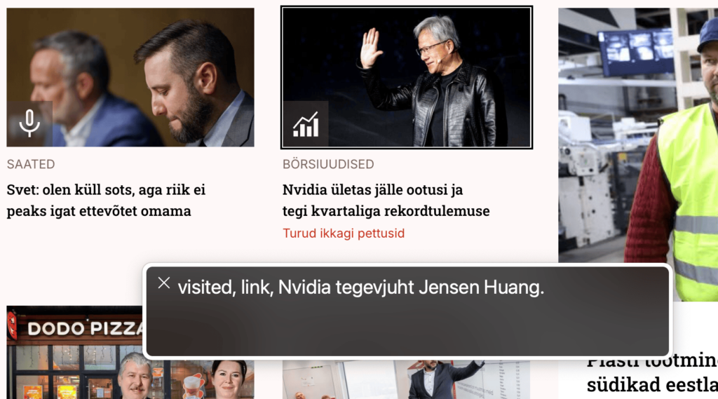
- Use ALT text, or alternative text, to describe the content of images on a website for visually impaired users.
- Many people with visual impairments use a screen reader, and ALT text allows the screen reader to read out the description of the image.
- You can easily add alternative text in various content management platforms such as WordPress, Drupal, and others, as well as in social media applications like Facebook, Instagram, and more.
- There is no need to use ALT text if the image is decorative.
- In connection with the accessibility law that will come into effect next year, it makes sense for you, or in collaboration with us if you need assistance, to conduct an accessibility audit of your digital service.
5. How can designers contribute to creating better AI?

- Andrea Grigsby suggests first considering whether an AI-based solution is even necessary and how it fits into users’ existing workflows.
- If it turns out that AI could create added value, then design the data input to be easy for the user, offering guidance and tips.
- For outputs, emphasize the possibility of errors in AI systems, such as asking the user to verify the data or creating automatic verification options in collaboration with developers.
6. What interesting insights does the data show about AI usage?

- Leonardo.ai has highlighted some fascinating figures regarding AI usage.
- The generative AI market is currently valued at $66 billion and is projected to reach $207 billion by 2030.
- 60% of marketers use AI in their daily work, for example, in content creation, campaign data analysis, and automating routine processes.
- 72% of marketers use AI for personalizing customer experience to increase satisfaction and brand loyalty.
- Of the companies using AI, 68% see an increase in content marketing ROI—return on investment.
7. What are the latest updates in Figma design software?
- You can now download a prototype created in Figma and use it offline. This is a great option if you’re going to a client meeting and are unsure about the internet connection there. Or if you are testing your prototype outside the office where the internet coverage might not be optimal.
- Additionally, there is now the ability to further stylize the underline of text, for example, changing the underline’s color, thickness, distance from the text, etc.
- What I also like is that, finally, you can set paragraph spacing individually for each paragraph when working with long text.
8. What are the design trends for the upcoming year?
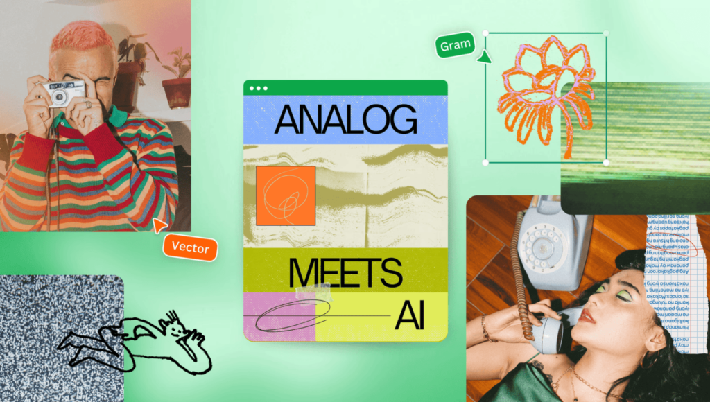
- The Canva team encourages experimenting with visual balance between analog and AI concepts in the coming year—but why not start now? They also suggest structuring designs with bold shapes and playing on the edge of professionalism and creativity, introducing the concept of “serious fun”.
- Check out ideas and examples for the new year in Canva’s blog post.
9. Why should you try Google NotebookLM?

- Sisendina võid üles laadida dokumente, sisestada linke välistele artiklitele ja YouTube videotele.
- NotebookLM is a versatile AI tool that allows you to create summaries based on the input data, engage in topic-specific conversations via an AI assistant, and even produce podcasts where AI hosts delve into the content.
- As input, you can upload documents, provide links to external articles, or include YouTube videos.
10. Why should you avoid placing text over images?

- Try to avoid placing text directly on images. Why? Because the text might not be easily readable.
- Older individuals, those with weaker eyesight, or users with less advanced phones may struggle to make out text on images due to poor contrast.
- Whenever possible, position the text separately from the image, or ensure that the contrast ratio meets accessibility standards: at least 4.5:1 for regular text and 3:1 for larger text (at least 18px font size or 14px bold).
And let me brighten your day with this thought: “A designer knows he has achieved perfection not when there is nothing left to add, but when there is nothing left to take away.” – Antoine de Saint-Exupéry.
Thank you for being here. 🙏

