
🍁 On the last day of Harvest Month (October), I’m excited to share stories, activities, and inspiring thoughts from the fields of user experience design and artificial intelligence.
If a picture is worth more than 1,000 words, and a prototype is worth more than 10,000 meetings, then how much might a meme be worth? 🤔
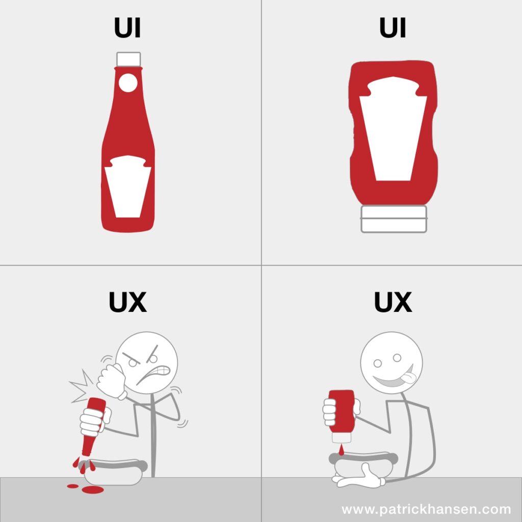
For me, this meme captures the valuable idea of how user interface design—in this case symbolized by a ketchup bottle—affects customer experience.
As a designer or product manager, you might be proud of a polished user interface, but if it doesn’t “work” for the end-user, a nice-looking interface ultimately misses its purpose.
1. Why you should try a program called Krisp.AI?

- If you work from a home office, café, or traditional office surrounded by background noise you don’t want reaching your mic during calls, Krisp.ai is here to help.
- This program can filter out background noise, like a colleague speaking loudly on the phone, children running around at home, or a neighbor’s barking dog.
- If you have a newer Mac, you can also use the Voice Isolation setting in MacOS instead of Krisp. It works well too.
2. What do tire companies’ websites teach us about design thinking?
❄️ 🛞 The tire-changing season is upon us, and with that, I’ve visited several websites. My winter tires needed replacing, so I had to do some research on new ones.
While there are many areas for improvement in terms of user-friendliness on tire company websites, I want to focus here on some positive findings that, in my view, demonstrate good design thinking. 👍
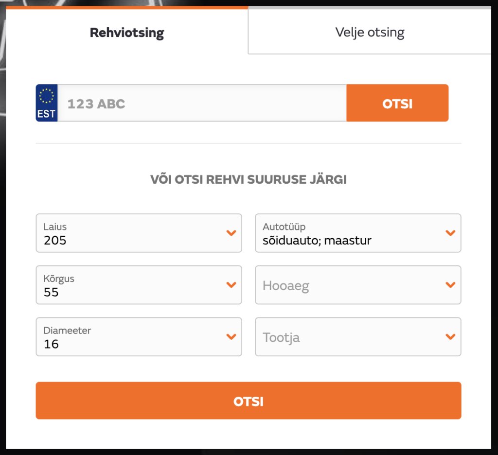
For example, on Vianor’s website, you can enter your car’s license plate number, and the site identifies the correct tire size for your vehicle. This saves users from having to think about the specific width, height, and diameter of the needed tires. 🤔
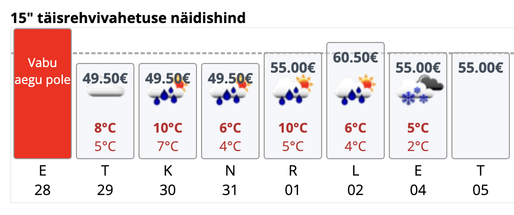
The Revid Pluss booking system, however, displays the 🌨️ weather forecast, which is one of the main indicators for deciding if it’s the right time to go for a tire change.
3. What is the glassmorphism style?
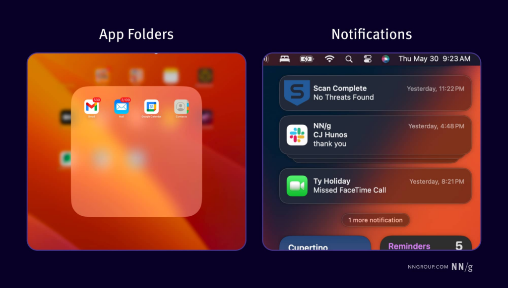
- A glassmorphic approach adds depth and visual hierarchy to designs by using transparency and frosted glass effects. Both Apple and Microsoft incorporate this trend into some of their design systems.
- By applying transparency, blurring, and gradients, a layered and elegant user interface appearance can be achieved.
- However, it’s essential to keep accessibility in mind. Ensure text is highly readable even on busy backgrounds by applying more background blur to maintain focus and provide adequate contrast for text and interactive elements. Read more on NNGroup’s blog.
4. How can user experience be improved through user flow analysis?

- Creating user flows helps to think through the paths users take or might take on your website or app.
- You can sketch user flows at the start of a project, using tools like FigJam. Additionally, existing paths can be analyzed with Google Analytics using the Funnel Exploration tool.
- Read more about different types of user flows on the Shopify blog.
5. What is a screen reader, and how does it work?
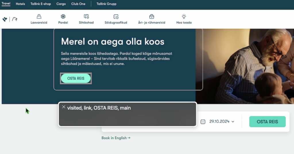
- A screen reader is a software tool that converts visual screen content into audible or tactile output, helping visually impaired users navigate computers and websites.
- The screen reader detects on-screen text and makes it audible through a speech synthesizer.
- Screen readers provide information about the structure of a webpage (e.g., headings, paragraphs, buttons) and allow users to navigate using keyboard commands.
- Screen readers read ALT descriptions of images and other alternative texts, giving users information about visual content.
- Next summer, on June 28, the Product and Services Accessibility Act will take effect, so it’s wise to become familiar with the requirements. If you need assistance, don’t hesitate to reach out to UX Estonia.
6. What’s new in Figma design software?
- In their latest Release Notes video, the Figma team provided an overview of the updates.
- The toolbar in design files has been modified to resemble an earlier version. This change was made because users didn’t like the gaps that appeared at the edges of the toolbar with rounded corners. See the following image.
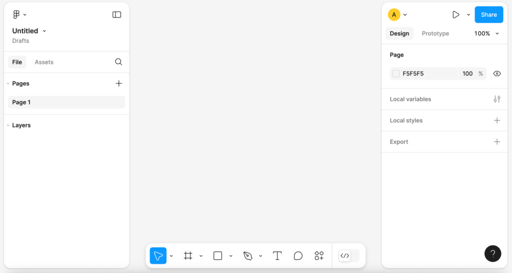
- As a solution, the extra gaps were removed because they simply take up space, and this “visual appeal” doesn’t pay off since as designers, we want as much workspace as possible for our designs.
- Personally, I’m still waiting for the AI updates that were once heavily promoted at the Figma conference but were later put on hold because the generated interfaces were too similar to well-known applications. I’ve heard that Figma has overcome the initial setbacks, made adjustments, and has already released some features in beta, with a small group of selected users able to test them.
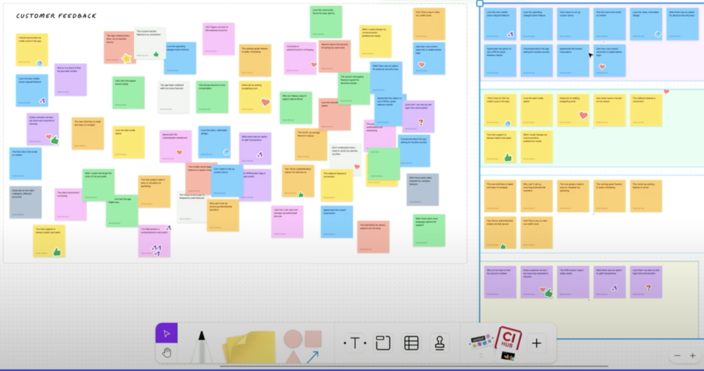
- A nice productivity update in the FigJam tool allows you to group sticky notes by color, author, and other attributes. This way, you can create logical structures from the creative chaos of brainstorming. 🙃
7. What’s going on in the UX/UI and AI Designer Portfolio Creation Mentorship Program?
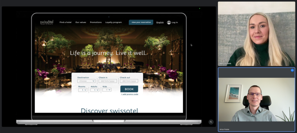
- Let’s just say there’s a lot of exciting and productive work happening. 🙂 My fellow course mentors and I are very fortunate to work with such talented and amazing people.
- We conduct the portfolio creation mentorship program at UX Estonia as a follow-up course to the UX/UI and AI design training (currently in Estonian).
8. What does ChatGPT AVM or Advanced Voice Mode bring?
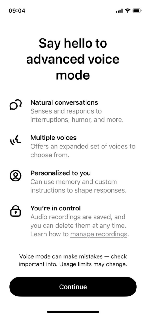
- AVM has finally arrived on my devices, and I can confirm that the quality of voice conversations and the speech rhythm in Estonian on ChatGPT are now much, much better.
- It’s also nice that you can choose between multiple AI voices to find the one you prefer.
- Another convenient feature is that you can replay AI responses.
- I recorded a short clip (in Estonian) to give you a sense of it, in case you haven’t yet accessed the latest version of voice conversation.
9. Will Claude start using the computer for us?
- The new feature allows Claude to use the computer like a human, moving the cursor, clicking, and typing text as if it had its own eyes and hands.
- Although the solution is still in the testing phase and may sometimes have errors, developers can try it early and help Claude evolve into an everyday digital assistant.
- The video demonstrates how Claude can navigate tabs, gather information, and fill out forms—actions that could be applied in many work areas in the future.
- I see great potential for this in software quality testing, allowing for the detection of issues and bugs in the user journey.
10. What is the “Playoff Method,” and how can it be used in ChatGPT?

- The essence: The “Playoff Method” is based on the idea of letting ChatGPT generate possible responses that “compete” with each other in a tournament-style setup.
- Example: Choosing a name for a podcast.
- Steps: Ask AI to generate 32 name candidates and pair them up. Let the AI compare each pair and choose winners for the next round until one name or idea prevails. Finally, request a ranked list and a detailed explanation of why the chosen answer is the best.
11. What does the AI startup Sierra do, and why is it valued at $4.5 billion?

- Funding growth: Sierra recently raised $175 million, increasing its valuation to $4.5 billion. In January, Sierra’s valuation was “only” $1 billion.
- Focus on AI agents: Sierra specializes in creating personalized AI agents for customer service, offering solutions for brand-specific communication. For example, the clothing brand Chubbies uses a sarcastic AI agent named Duncan, tailored to their brand.
- AI models used: Sierra uses a multi-model solution (“constellation”), incorporating large language models (OpenAI, Anthropic, Meta) and related supervisory models to ensure accuracy.
- Strong competition and growth potential: It’s predicted that the AI industry will mirror the development pattern of the cloud services market, with Sierra potentially becoming a leading company in the AI agent market.
12. What design marvel did the Finnish company create?
- James Bond-style riding experience: The Finnish Pegasus electric hydrofoiler allows you to glide above the water.
- Fast and durable: Its carbon fiber body and powerful battery pack give this watercraft a top speed of up to 55 km/h and a two-hour ride time.
- An exclusive toy for enthusiasts: Priced at €139,900 (plus additional costs for batteries and a charger), it’s not for everyone, but its unique handcrafted design makes it a distinctive marvel to behold.
13. What are the new features of the Midjourney image editor?
- New image editor: Allows Midjourney users to upload images from their computers and customize them by adding or changing elements, cropping, and extending the image.
- Changing image textures: A new mode assesses the content of the scene and can modify textures, including the appearance of lighting and materials as desired.
- Manual control options: Users can control image editing through text-based commands and selected areas.
14. What updates were added to Canva software?
- Dream Lab image generator: A new AI-based tool that allows users to create visuals from text, using the Leonardo.AI Phoenix model. Users can choose preset styles or upload their own images to customize creations to their needs.
- Interactive polls and charts: Added features for creating polls and new chart types to better visualize extensive data.
- Check out other updates on the Canva blog.
🎬 I’d like to end this post with a thought from Frank Chimero: “People ignore design that ignores people.” If we don’t understand and consider our client’s needs in designing our solution, we may fail to connect with them in a meaningful way. Thank you for reading to the end. 😊

