As a user experience designer and expert, my job is to help awesome teams around the world in designing user-friendly solutions that solve real problems for their customers. As you know, while a happy user will help your product grow, an unhappy one doesn’t. It’s as simple as that.
Conducting UX audits and doing user research are some of my favourite activities, helping digital products become more user-friendly. Suggestions I make in my user experience audits are based on the industry’s best practices, user experience studies (for example in UX Estonia, we have conducted over 1 000 studies so far), insights from web/app analytics and my own past experiences designing and user-testing different products with end-users.
While crypto products are becoming more and more mainstream, this also sets growing expectations for the user experience. While early adopters get through many usability obstacles and forgive most of the errors they experience, the majority of users that start to use the service at a later stage, usually have more expectations as they might come from a different background of experience.
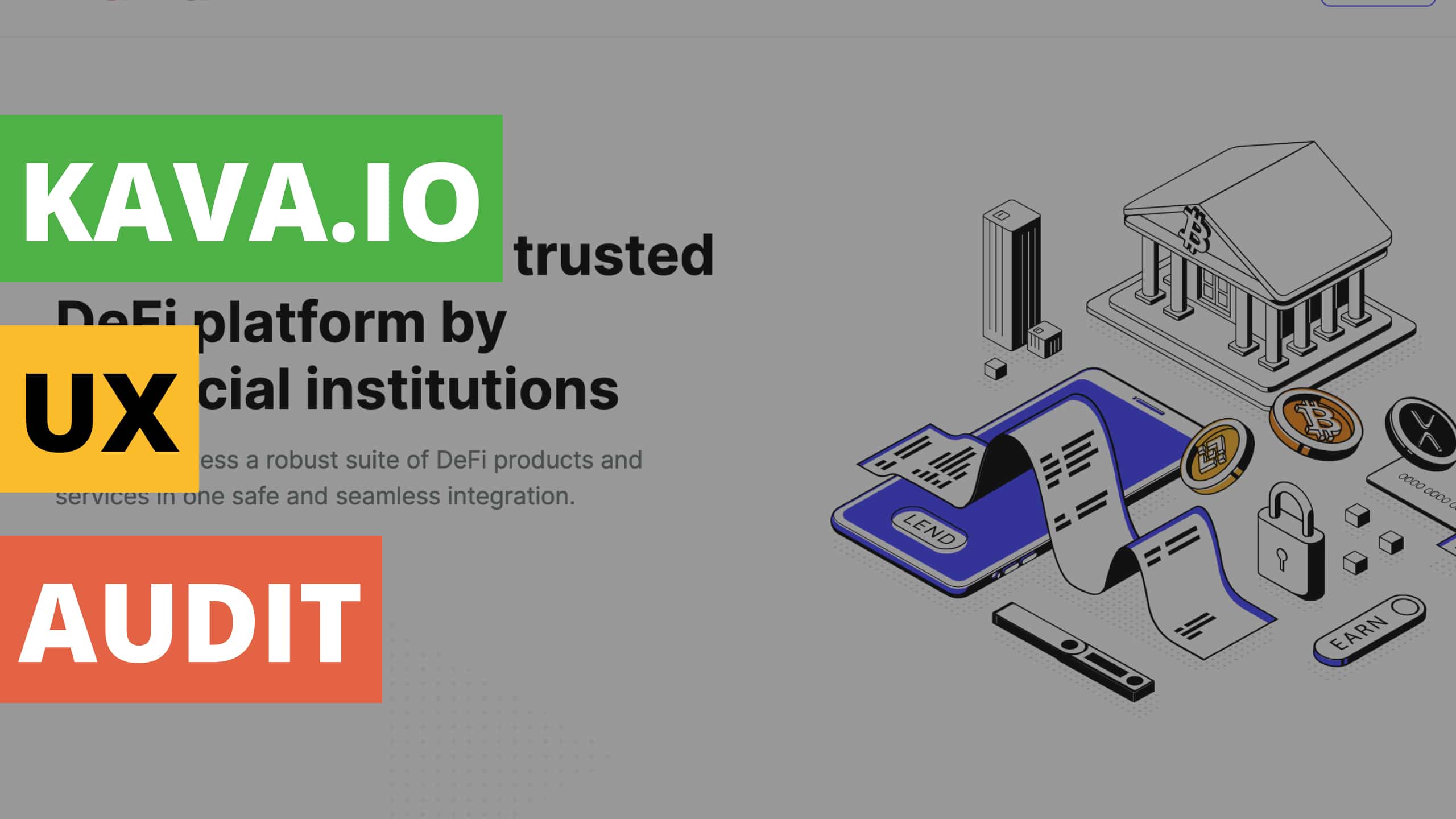
In this blog post, I decided to look at Kava.io, a DeFi (decentralized finance) platform. Let’s take a look at its website UX / UI design strengths and points to improve.
EDIT: Kava.io website has been updated recently, so you might see some differences while comparing this blog post with the live site.
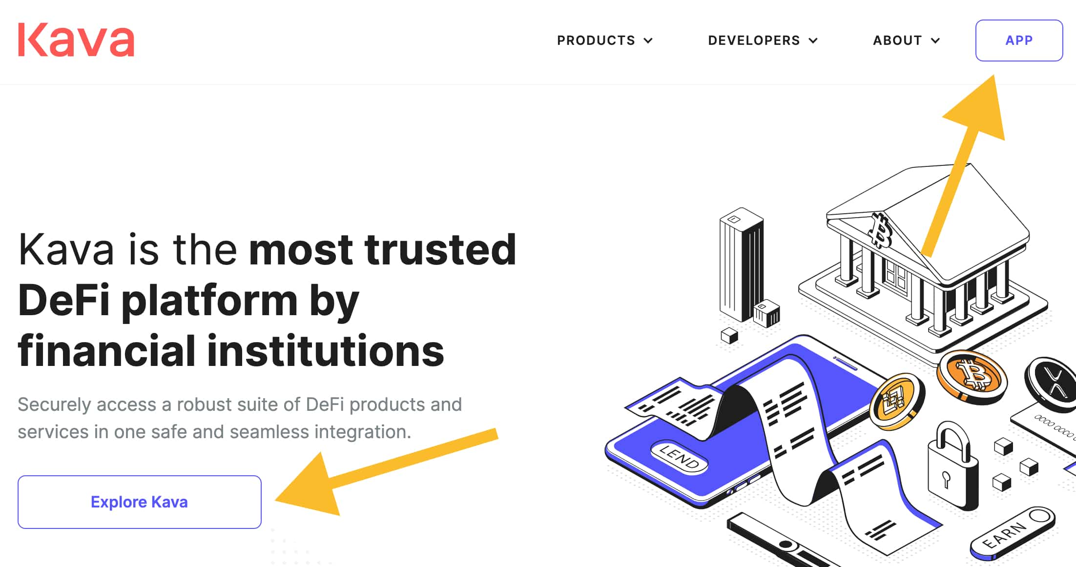
1. The first click is important 🖱️
When users come to your site for the first time, they want to understand what is the most important thing to do there. Having a prominent call to action helps users get started on their journey.
On the Kava.io website, you can see a large “Explore Kava” button that is meant to help users to get more information about the solutions Kava provides.

Did you know that:
- A participant who clicks down the right path on the first click will complete their task successfully 87% of the time.
- A participant who clicks down the wrong-path on the first click, tends to only successfully complete his/her task 46% of the time. [Getting The First Click Right by Jeff Sauro]
2. Same colors may indicate same function for the user 🎨
While using your site, users get a lot of cues about how to navigate there. For example, users try to understand what’s clickable and what’s not.
On the Kava.io website you see that the buttons are designed in blue colour.
There’s a text element named “PRODUCTS” that’s also in the same colour. What I’ve experienced in my usability studies is that people start perceiving all same-coloured elements as clickable, if most of these are. And when some elements don’t work as expected, users get confused.
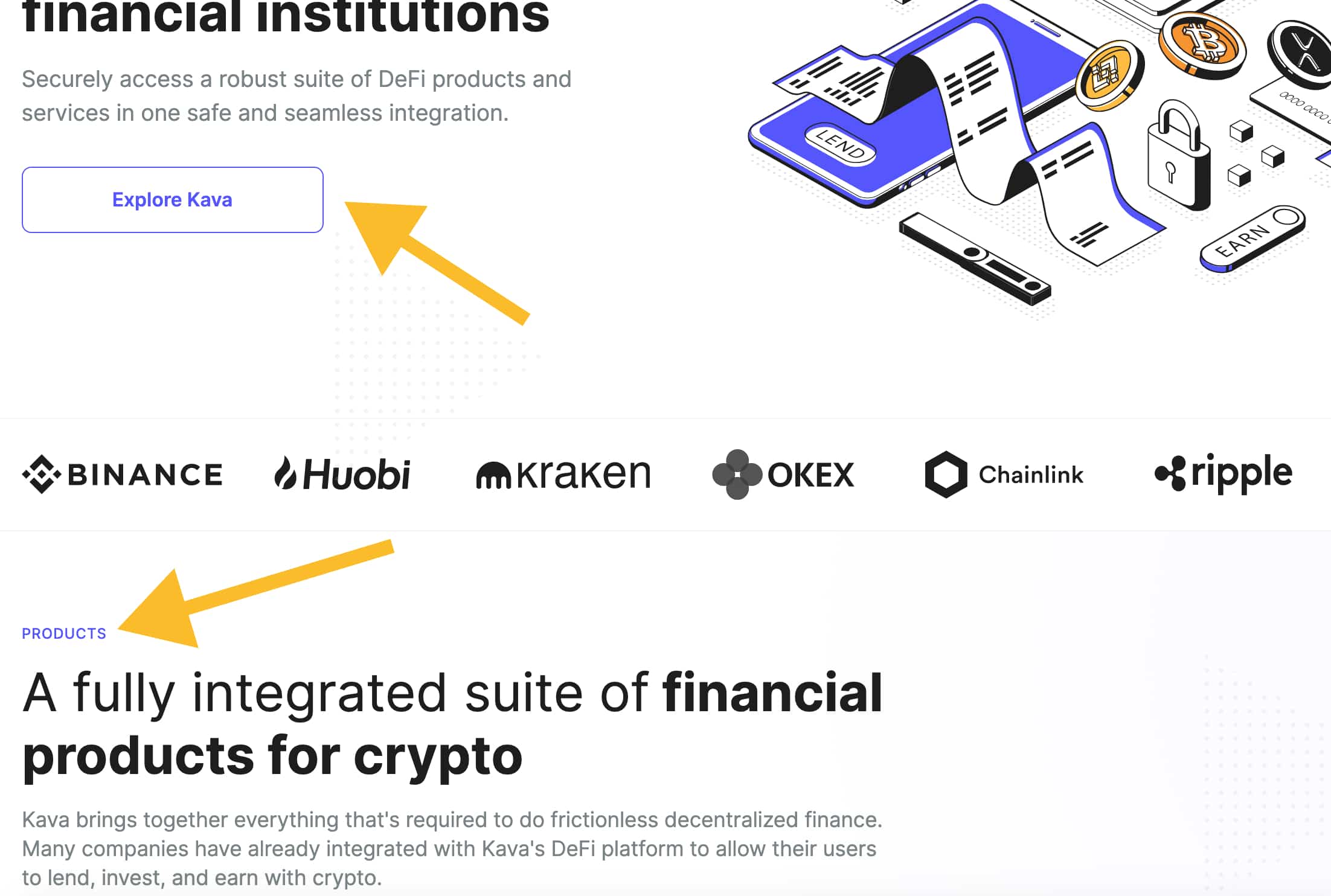
If “PRODUCTS” is not meant to be clickable, consider using a different colour.
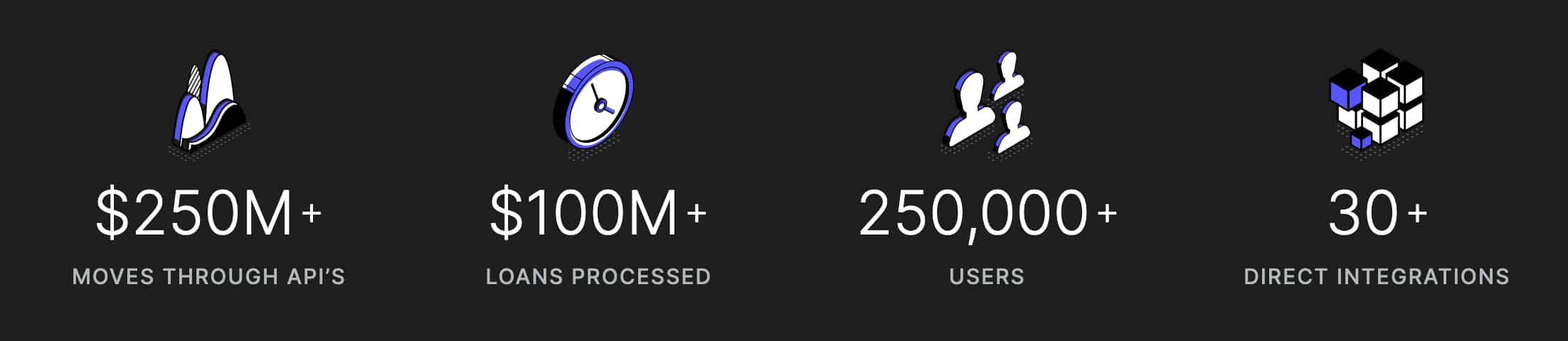
3. Trust marks convey trust 🙂
Using the right trust marks on a website will let your audience know that you mean business.
Kava.io is about finance, so the trust marks that they use are related to money, user base and integrations. Users tend to trust companies that thrive and bigger numbers convey more trust – “$250M+”, “250,00+” etc.
4. Make sure links are working 🔗
While moving my mouse cursor on an “EARN” label, a hand icon appeared. This indicates that the element must be clickable. Unfortunately, the link is broken. The same applies to labels “LEND”, “BORROW”, “EXCHANGE” etc.
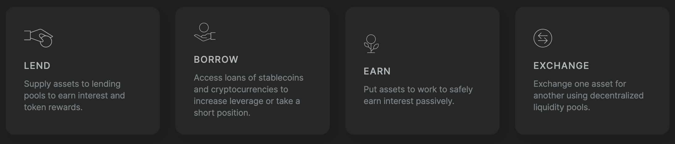
Broken links might make users think that the site is not maintained well and second-guess everything that’s shown on there.
5. Call to action needs an action 📣
On one of the Kava.io website sections, you see a nice call to action slogan: “Join the fastest growing DeFi ecosystem”. While the slogan, the icons below it and nice illustrations on both sides make a beautiful composition, the questions that might rise to the user could be: “How can I join? I clicked on the Binance icon, but it doesn’t work.”
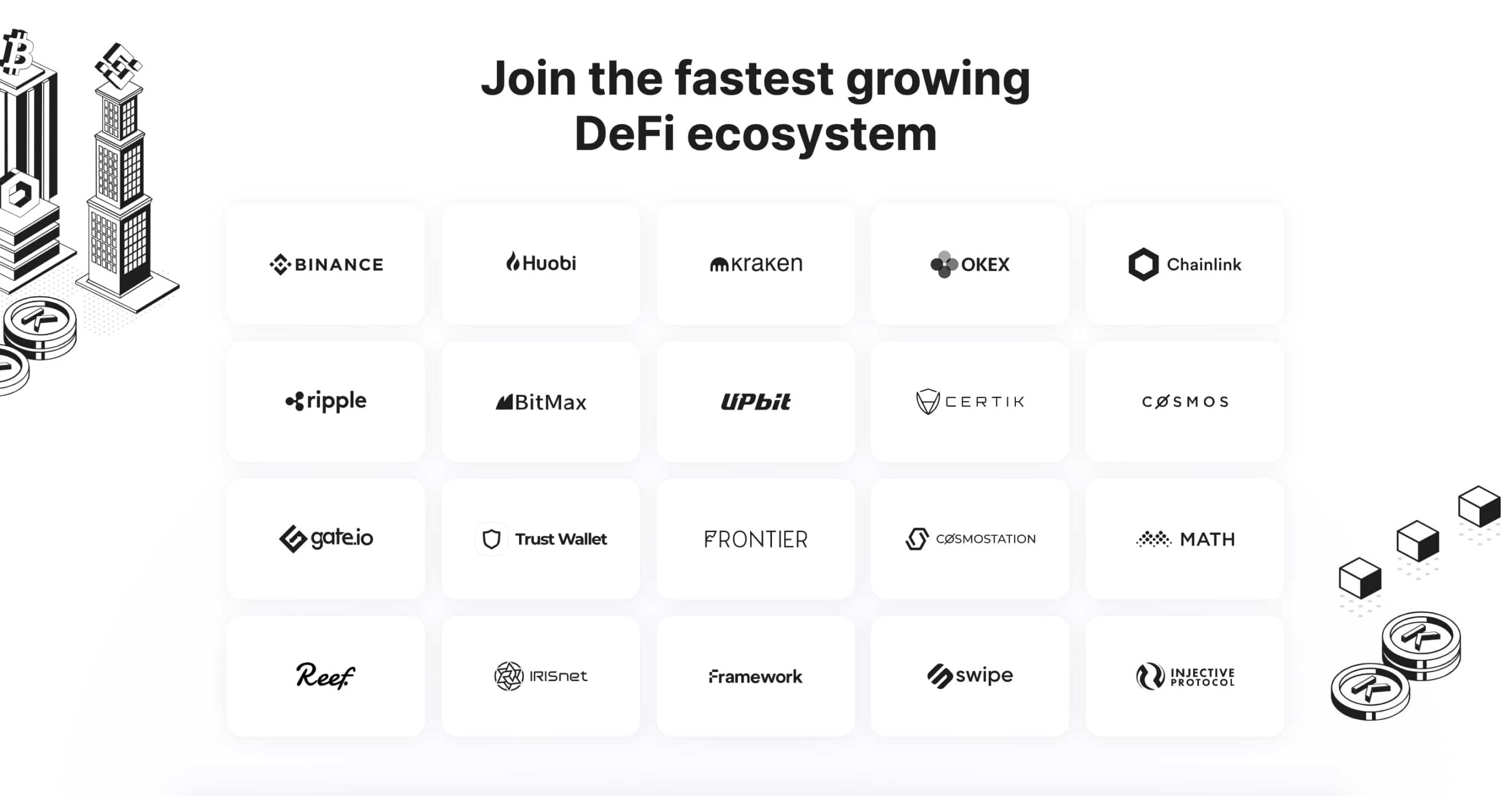
In these cases try using a simple link like “Start now” or “Explore solutions” to guide the user in the right direction.
There are many more points that are good and also things to improve on the Kava.io website. If you would like to have a full report regarding your own portal, website, e-shop or any other digital solution, feel free to check out our UX expert audit service.