
The local municipal elections have ended in Estonia, and the winners — along with key lessons — have been revealed.
Every political party emphasizes that everyone matters, yet unfortunately, their websites don’t fully reflect that message — particularly when it comes to accessibility.
Let’s take a look at some of the accessibility issues found on party websites and discover what can be learned from them.
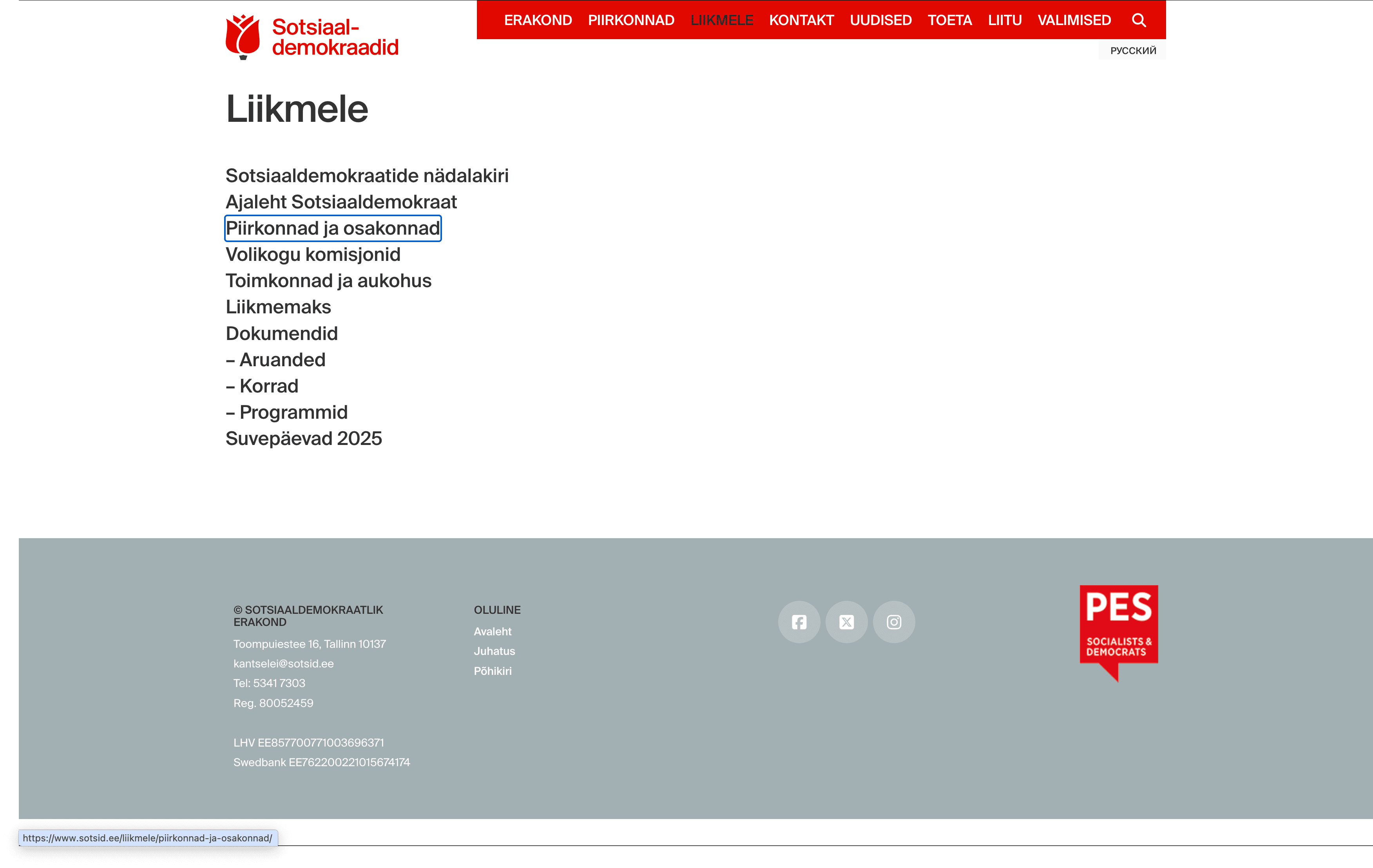
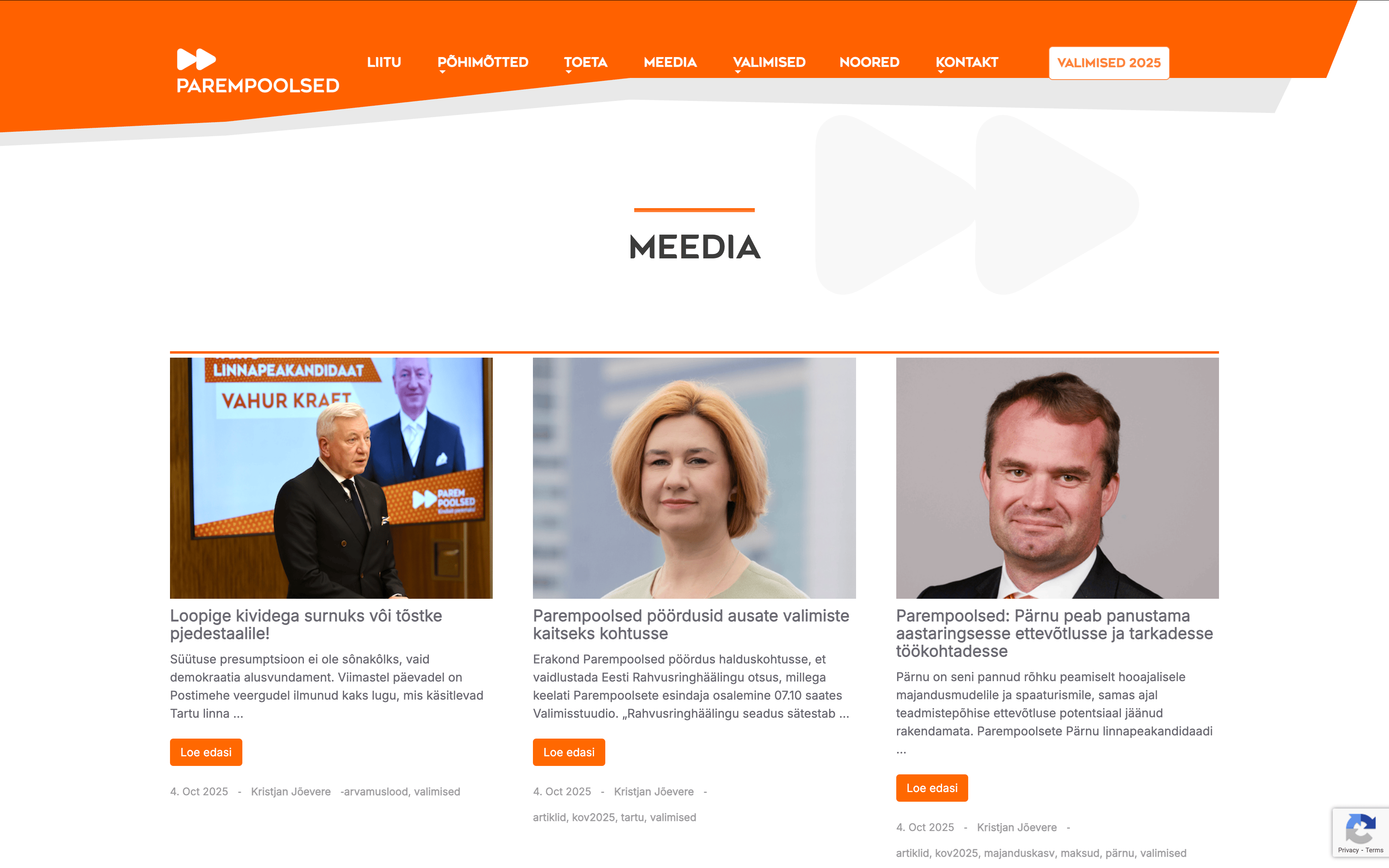
1. Missing “Skip to main content” link
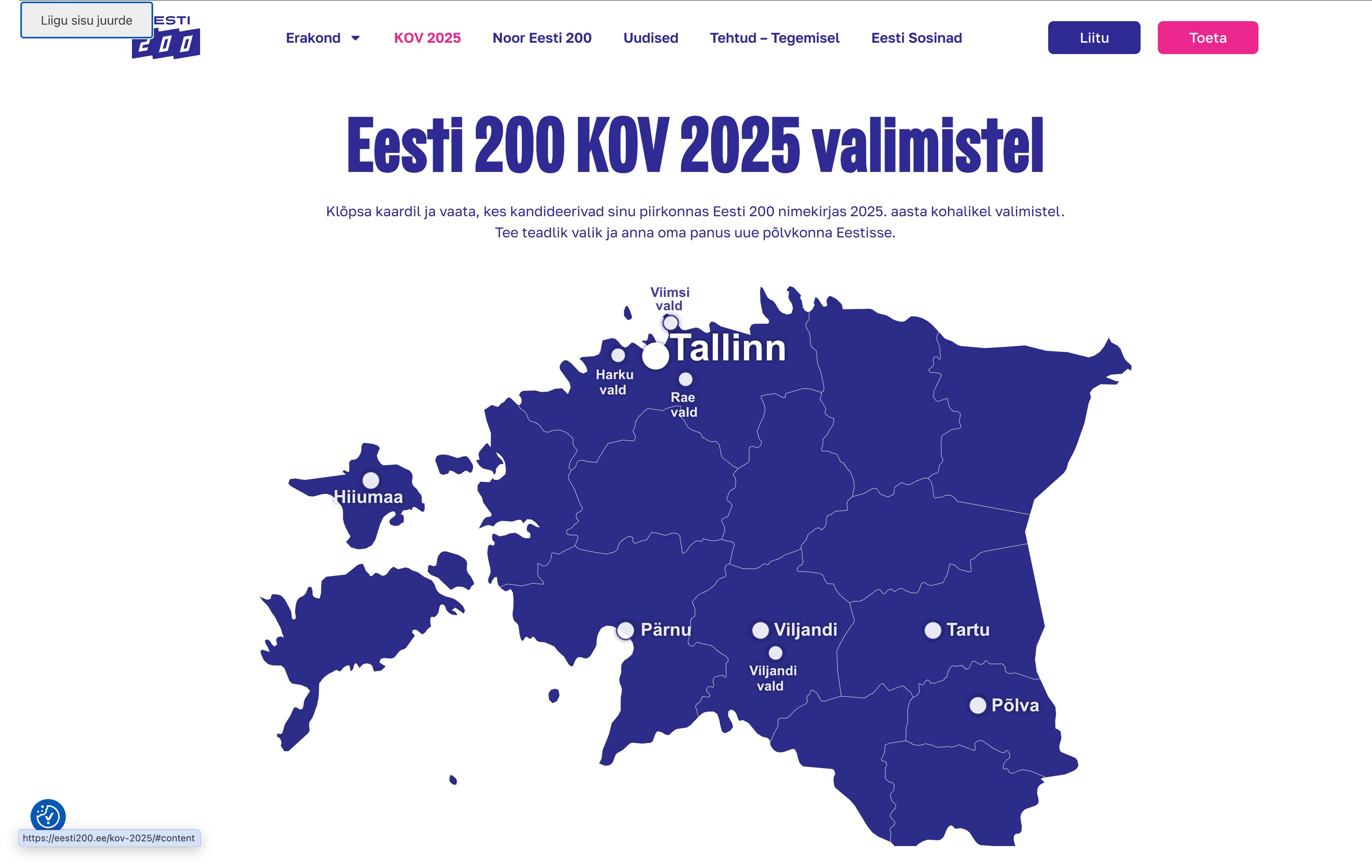
The “Skip to main content” feature allows users — such as those with visual impairments or anyone who navigates without a mouse — to skip past the main menu using the keyboard. This way, they don’t have to move through the entire navigation menu every time a new page is opened and can go directly to the main content.
This shortcut was missing on the websites of the Reform Party, Social Democrats, Conservative People’s Party of Estonia (EKRE), and the Right-wingers (Parempoolsed). It was also absent from the main page of Isamaa, though it did exist on their election program subpage.
On the Eesti 200 website, the button appeared before the main menu when navigating with the Tab key, but unfortunately, it didn’t function properly.
On the Centre Party (Keskerakond) website, the “Skip to main content” button functioned properly; however, the text did not align with the selected site language. It remained in English, even when viewing the Estonian version of the page.
2. Invisible focus
For visitors who cannot use a mouse, for example due to muscular dystrophy or Parkinson’s disease, it must be clearly visible where they are on the webpage while navigating with the keyboard or assistive device.
A website should visually indicate which link, button, form field, or other interactive element is currently in focus when the user moves around the page using the Tab key.
A visible focus indicator was present on the websites of Eesti 200, the Social Democratic Party, the Reform Party (partially), and the Centre Party (partially).
However, it was missing from the websites of the Right-wingers (Parempoolsed), the Conservative People’s Party of Estonia (EKRE), and Isamaa.
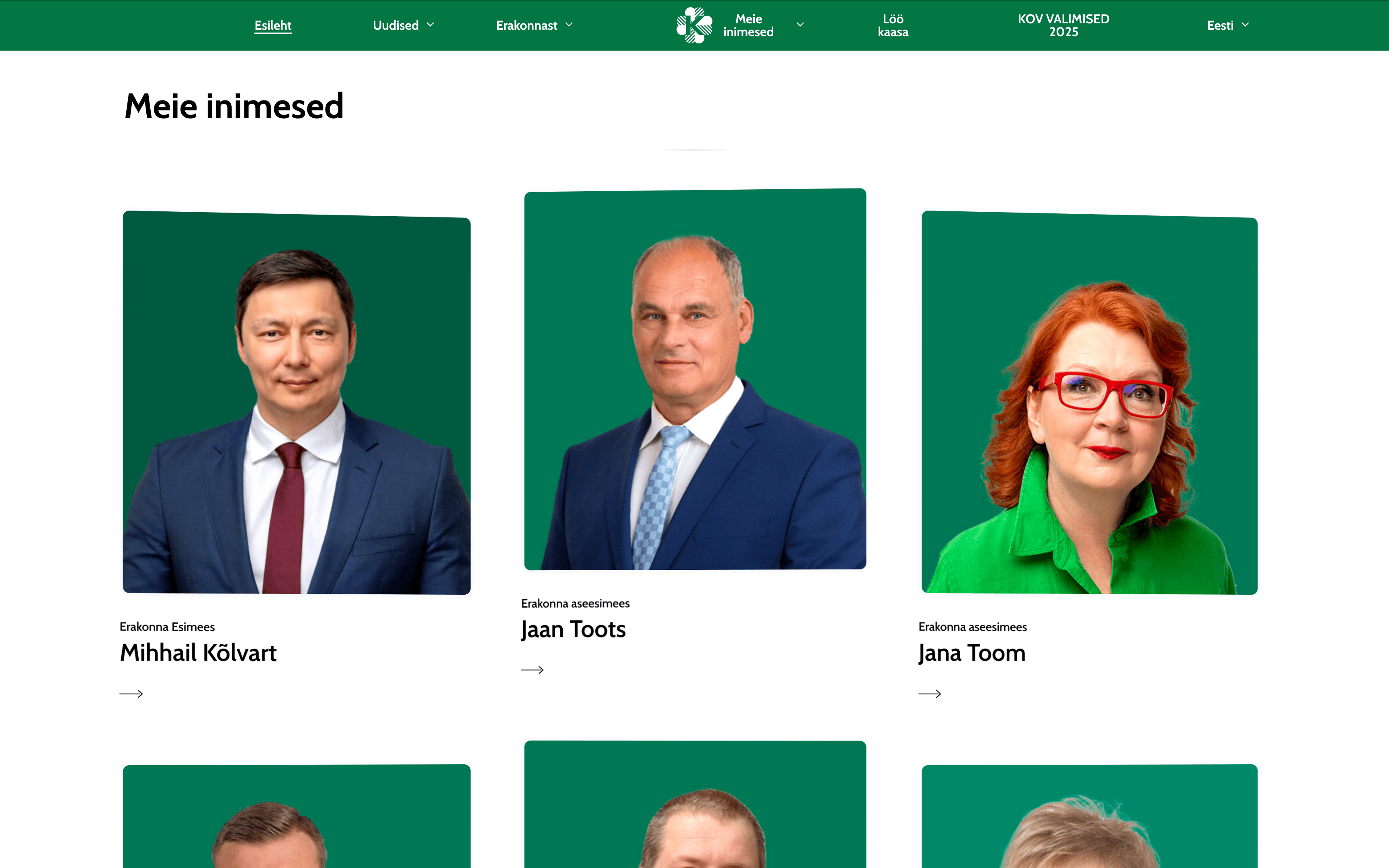
3. Incorrect heading structure
A correct hierarchical heading structure is important to ensure that website content is clear and easy to navigate for screen readers used by people with visual impairments.
Headings should follow a logical and consistent order, starting with the highest level, such as H1, and then moving down to H2, H3, and so on.
When headings are out of order, it can confuse screen readers and make it harder for visually impaired users to access the page content.
On every party’s website, there were cases—some more frequent than others—where the heading structure was not applied consistently.
4. Images without descriptions
A visually impaired person cannot see images on a website, which is why it’s important for content moderators to add descriptions to them.
In WordPress, for example, an image description can easily be added through the Alt Text or Alternative Text field in the image settings.
It’s also important to remember that purely decorative images that have no meaningful content do not need descriptions.
Across the political parties’ websites, the situation was quite similar. In most cases, images were properly described or marked as decorative.
However, there were still instances where necessary image descriptions were missing, meaning that visually impaired users could not access the information.
5. Text contrast issues
A voter with impaired vision may struggle to read text that lacks sufficient contrast.
The following contrast requirements apply to text: if the font size is smaller than 18 points (or smaller than 14 points in bold), the contrast ratio between the text and the background must be at least 4.5:1. For larger text, the minimum contrast ratio is 3:1.
Every party’s website had areas where text contrast could be improved.
In conclusion
The points above highlight some of the accessibility issues that stood out during a quick review.
All criteria for assessing digital accessibility are defined in the European harmonized accessibility standard EN 301 549, which is largely based on the WCAG (Web Content Accessibility Guidelines) success criteria.
Starting this year, larger companies must comply with accessibility obligations under the European Accessibility Act. However, public sector websites have already been required to meet the EU Directive 2016/2102 since 2019.
Although political parties are not legally obligated to ensure their websites are accessible, it is essential to consider this as a matter of principle and responsibility.
Accessibility is essential to ensure that everyone, regardless of their abilities, has equal access to information.
Moreover, good accessibility can serve as a competitive advantage — when implemented well, it can even help achieve better results in elections.