1️⃣ What is the “hamburger” icon?
The hamburger icon refers to the three-line menu symbol: ≡. It usually represents a navigation menu.
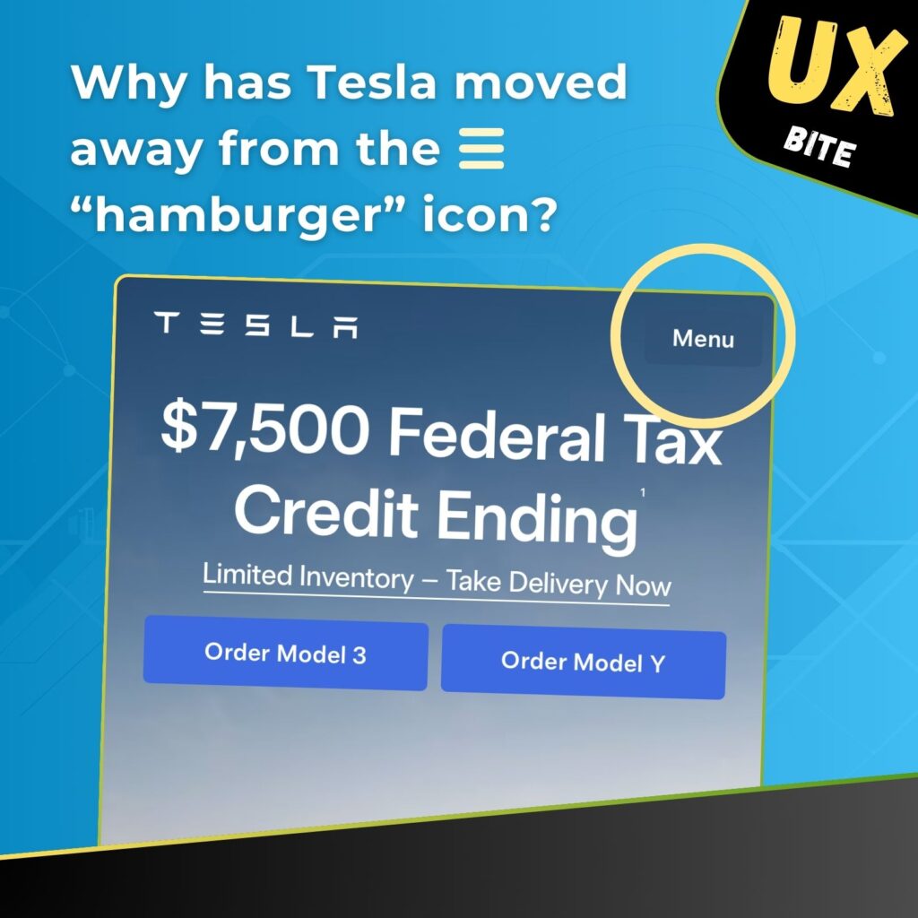
Tesla, however, uses the word “Menu” instead. Interestingly, Ferrari does the same.
2️⃣ What should we make of this?
Using only an icon is often not enough.
You might assume most people recognize the three lines as a menu icon because it’s so common. But research – both ours and others’ – shows that words often carry more weight.
Sometimes users don’t even notice the icon or assume it’s just a decorative element, especially when placed near a logo.
A word, on the other hand, is more likely to draw attention and encourage exploration.
3️⃣ So what should you do?
Use both – the icon and the word.
An icon with a label like “Menu” is usually more visible and clickable. We’ve seen this in our own client projects, where adding the word increased menu usage.
Try it on your website and see what happens!
4️⃣ For content-heavy websites or apps, consider using a bottom tab bar.
That way, users don’t need to reach to the top of the screen as key options are instantly accessible.
P.S. If you spend some time on Tesla’s mobile site, you might start to think the letter “E” in the Tesla logo is the menu. 🙂