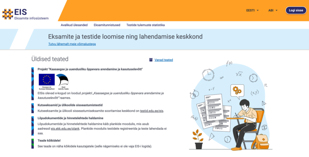
We are pleased to share a case study from our UX/UI design and user research project for the Exam Information System (EIS). In this project, we applied a user-centered design process to analyze the user experience of exam takers and prototyped improved solutions for end users.
The user-centered UX/UI design process begins with setting the goal
As national exams are transitioning from paper to digital, it is important that this change does not worsen the experience for exam takers. Our goal was to ensure that students do not receive a poor grade due to the user experience of the system. Our aim was to identify and solve situations where users may not understand the logic of the exam portal and tasks, potentially causing difficulties in taking the exam.
Understanding the user is the foundation of a successful information system
To offer a good user experience, it is essential to understand how users think and behave, that is, to put oneself in the shoes of the exam taker. One appropriate method for understanding users’ joys and frustrations is to test the user experience with actual target group users, in this case, students.
User experience testing is a research method conducted in an interview format, where users are asked questions and tasked with solving specific challenges. The major advantage of this method is the ability to directly observe users’ actions, listen to their feedback, and identify areas for improvement in terms of convenience and ease of use.
For testing the Exam Information System, a sample exam was created in the existing portal, allowing us to conduct a realistic, life-like exam with students.
User experience testing reveals strengths and areas for redesign in the information system
The user experience testing provided us with a lot of useful information. We identified solutions that worked well for users and areas that needed improvement.
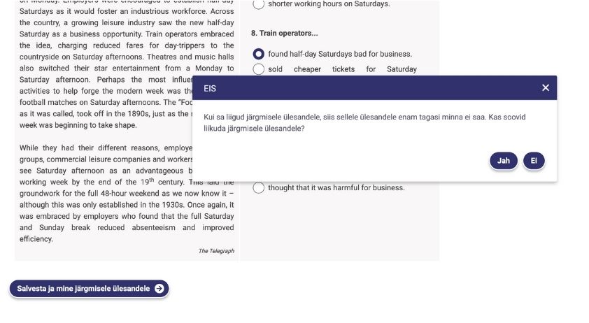
For example, during the exam, most users felt stressed when they were unable to choose the order in which to complete tasks. They mentioned that if the first task doesn’t immediately make sense, they would prefer to move on to a more suitable task to get started. On paper exams, this option is available, and users have a similar expectation for digital exams.
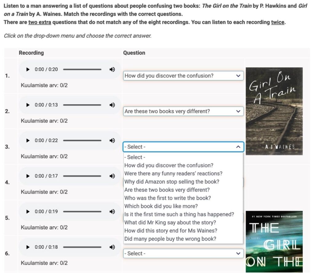
It also became clear that if a task required repeatedly selecting answers from a drop-down list, it was important to visually distinguish which options had already been selected in order to reduce the user’s cognitive load.
In collaboration with students, we identified several other situations that needed refinement from a user experience perspective. At the same time, we discovered parts of the system that were simple and convenient and didn’t require changes.
It’s worth retesting solution ideas with users
Experienced UX/UI designers know that sometimes user experience research reveals quick and obvious solutions, but larger changes should still be retested. This ensures that the changes made actually improve the user experience.
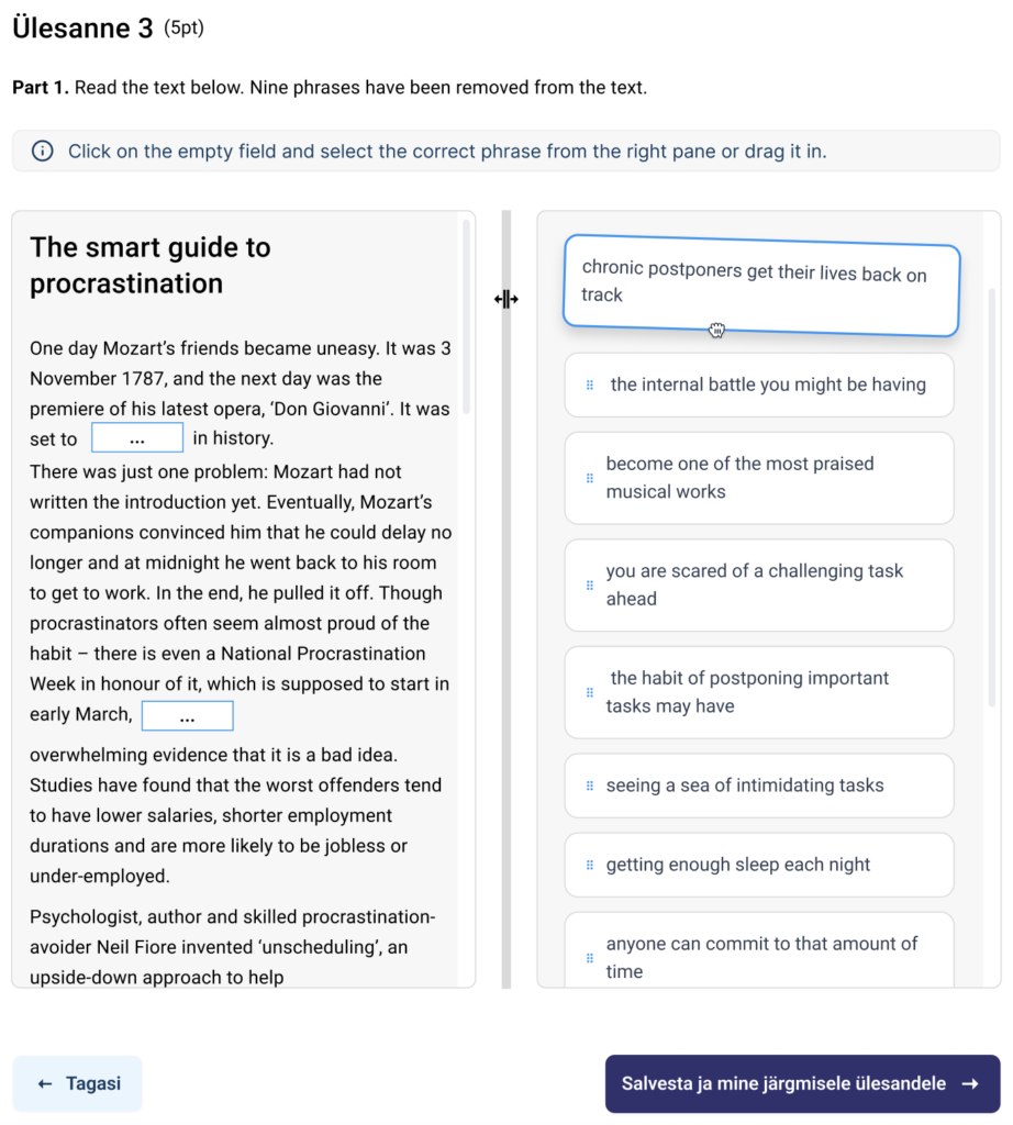
For example, in this project, we came up with the idea that using a modal window to select answers could speed up the task-solving process for users, especially in longer text tasks where they previously had to drag the correct answer into a blank. Dragging required more motor effort from the user than clicking, especially when dragging over a longer distance. Therefore, we thought that a modal window with answer options, which opens by clicking on the blank, could make the task-solving experience more convenient for the students.
When we tested the prototype, users gave clear feedback that selecting answers from a modal window was not more convenient than dragging, because the modal partially obscured the text task itself. Likewise, a drop-down menu wasn’t the solution, as it also covered part of the text task, which users didn’t like.
Through testing, we concluded that dragging had fewer drawbacks than other solutions, and for certain tasks, users could choose answers by both dragging and clicking.
Implementing a user-centered design process ensures success
The experiences gained during the Exam Information System project reaffirmed that a user-centered approach is crucial in service development, especially in the field of educational technology, where students’ needs and challenges are diverse, and digital literacy is closely tied to their success.
As the capabilities and content of digital solutions continue to evolve, the user-centered design process must be a regular activity. Systematic user experience testing and iterative design are necessary to ensure that the digital solution remains up-to-date and meets user needs.
We would like to thank the Ministry of Education and Research for their excellent collaboration.

