Hello there! 👋
It’s time for another UX & AI Bites episode.
Today we will look at the following topics:
📦 What can we learn from the design of Omniva’s package tracking journey?
🤖 Why should you try the UX Pilot AI program?
🛠️ How does aria-label help ensure accessibility?
🧓 Who are Generation Beta?
🎯 Why use the word “motivation” instead of “conversion”?
1. What can we learn from the design of Omniva’s package tracking journey?

I sent a package through Omniva, and when I wanted to check if the package had arrived, I noticed an orange circle with a white checkmark inside, followed by the text “Shipment delivered.”
However, the other steps listed above, such as “Shipment registered,” “Shipment is on its way,” and others, were marked with a green circle and also a white checkmark.
The orange circle mistakenly gave me the impression that the package had not arrived. Typically, the color orange indicates a status that is pending or requires attention. In this case, it’s also Omniva’s brand color, and perhaps they wanted to emphasize a successful delivery with it.
Later, I also noticed the status text at the beginning of the list, “Shipment delivered.”
What can we learn from this?
- When marking a successful status, use the same color consistently, for example, green in this case.
- In addition to color, indicate the status with more precise text to ensure accessibility, such as “Shipment has been delivered” or “Shipment has not yet been delivered.”
- Do not display a checkmark icon until the step is completed.
Do you agree that seemingly small things can have a significant impact on the customer experience?
2. Why should you try the UX Pilot AI program?
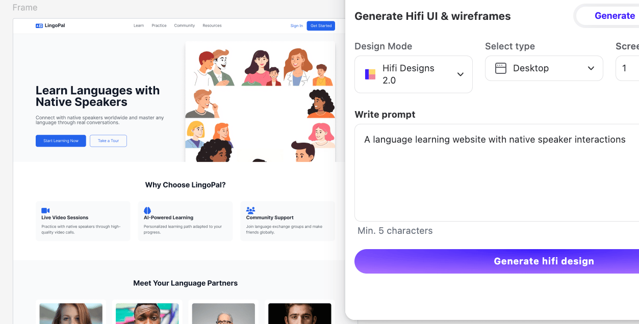
UX Pilot’s Figma plugin allows you to generate user interfaces in Figma design software based on text input. You can create views for both mobile and desktop.
UX Pilot’s website offers even greater AI capabilities – creating multiple page views at once. In addition, it allows you to adjust views using an AI chat and, of course, export them to Figma so you can make changes according to your needs.
However, a current limitation is that UX Pilot doesn’t fully utilize Figma’s auto layout capabilities, and some views lack reusable components. Moreover, colors and text styles aren’t defined as Figma styles, which is essential for consistency.
Despite these issues, the software offers powerful capabilities for quickly starting a design and adjusting it according to project needs in Figma.
If you want to get more out of UX/UI and AI design software, you are welcome to attend the training.
3. How does aria-label help ensure accessibility?

The aria-label attribute, part of the Accessible Rich Internet Applications (ARIA) framework, provides text-based descriptions for UI elements—buttons, links, or icons—mainly for screen readers.
This is particularly useful when:
- The element lacks visible text (e.g., icon buttons).
- The text isn’t clear enough (e.g., abbreviations).
Check out earlier newsletters for insights on screen readers and ALT text importance if you missed them!
4. Who are Generation Beta?

From this year onward, we enter the era of Generation Beta — those born from January 1, 2025.
While we can’t predict their future experiences with complete certainty, we can infer trends.
Defining traits:
- Integration of technology in daily life like never before.
- Artificial intelligence playing a role in education, healthcare, home robotics, and more.
- Automated transport systems and cutting-edge innovation.
From a customer experience perspective, I think personalization will be the key focus for Generation Beta. While we collect vast amounts of customer data today, AI’s potential to utilize it is still evolving.
5. Why use the word “motivation” instead of “conversion”?

I like to use the word “motivation” instead of “conversion” from time to time. Why do I encourage you to try the same? Because when we talk about conversion, for example, how we managed to convert users into paying customers, it leaves a rather technical feeling.
However, when we talk about motivation, the goal takes on a more human meaning. In marketing meetings, we start talking more about what the customer’s motivation behind the conversion is. The picture widens and better discussions arise about what are the obstacles that need to be overcome from the customer’s point of view.
Motivation-based conversion analysis also allows us to ask questions based on user experience. For example, if a campaign did not bring the desired number of leasing contracts, then what failed in motivating the user?
This question cannot be answered simply by saying that the campaign was poor and therefore the conversion was poor. Instead, we must go into more detail to analyze the motivation aspects of the customer journey. The motivation problem can be diverse – the clarity of the campaign message, the understandability of the landing page, the price of the product or service, etc.
Let’s end today’s newsletter with an insightful quote to inspire testing and validation:
“If you want a great site, you’ve got to test. After you’ve worked on a site for even a few weeks, you can’t see it freshly anymore. You know too much. The only way to find out if it really works is to test it.”
– Steve Krug, Author of Don’t Make Me Think: A Common Sense Approach to Web Usability
Thank you for reading to the end. 🙏
Have a wonderful day! ☀️