Hi!
I hope you’re enjoying every moment of the summer sunshine! ☀️ 🏖️ 😎
In this edition, I happily bring you the following UX & AI bites:
💡 What can we learn from Swedbank’s table design?
🤖 What opportunities does Lovable AI create?
🎥 What are the advantages of Google’s Veo 3 model?
🎨 Why should you give Flowstep.ai a try?
🦘 Can users skip straight to the content on your website?
1. What can we learn from Swedbank’s table design?
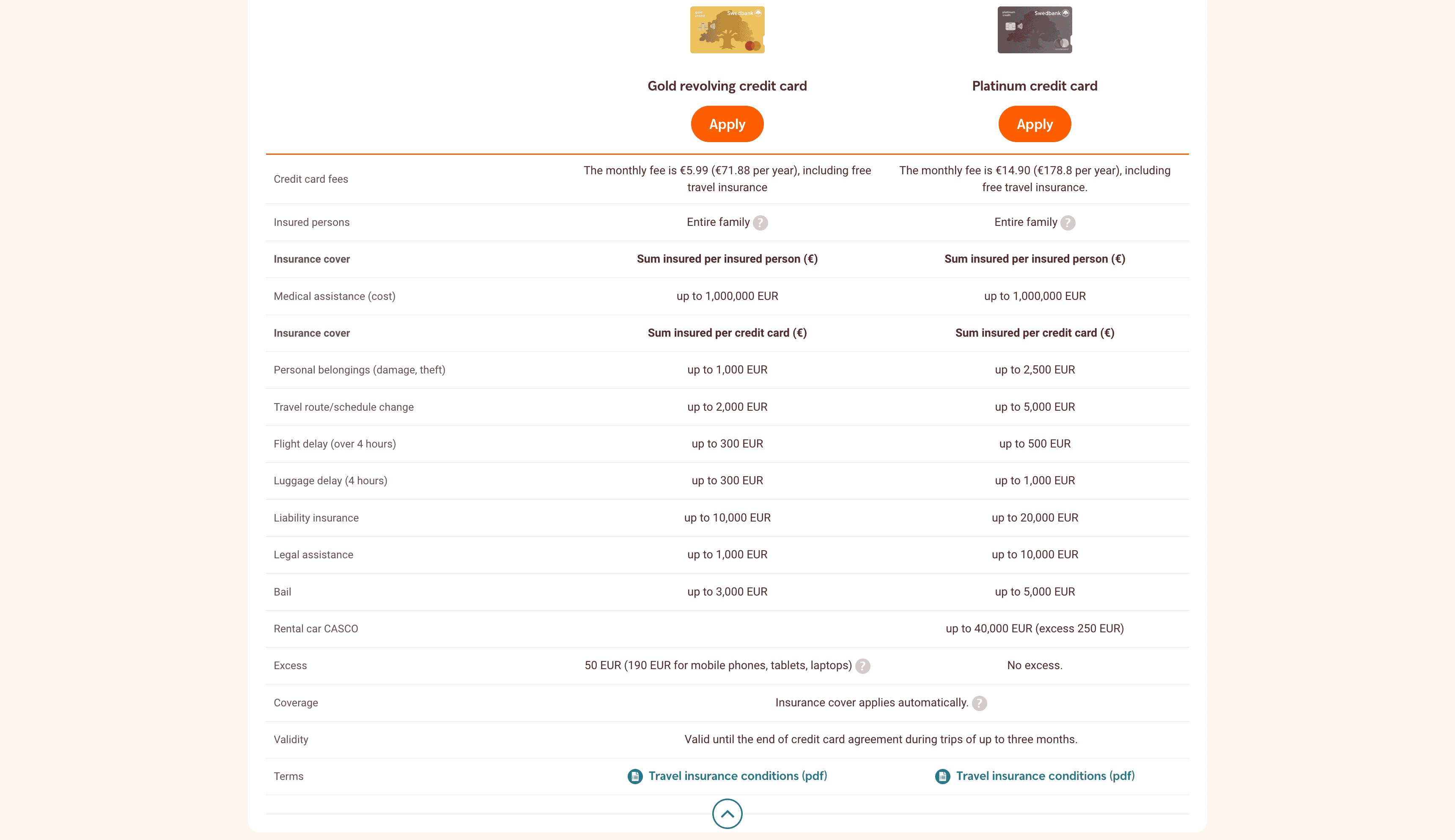
Before heading off on a trip, I wanted to compare insurance coverage for Gold vs. Platinum credit cards and came across this comparison table (view above). It had some classic UX pitfalls common to tables.
Three ways to improve this table:
1. Consider implementing a zebra stripe pattern – where the row background alternates between two colors, for example, one white and the other gray. This pattern makes it easier for users to keep track of rows and info.
2. Help users stay on track – when a user hovers over a row, highlight its background or change the border style. This acts as a visual guide, especially when combined with the zebra pattern.
3. Don’t leave cells blank – if a benefit doesn’t apply (e.g. Gold card doesn’t include rental car insurance), write “Not included” or use a dash “–” instead of leaving it empty.
From running UX tests, I’ve seen that blank cells in comparison tables often confuse users – some think the content didn’t load properly and refresh the page; others assume the feature applies to all options.
As designers, it’s our responsibility to maintain a low cognitive load for our table users. When a table becomes difficult to scan, users are more inclined to abandon the task – and that’s not our goal! 🙂
2. What opportunities does Lovable AI create?
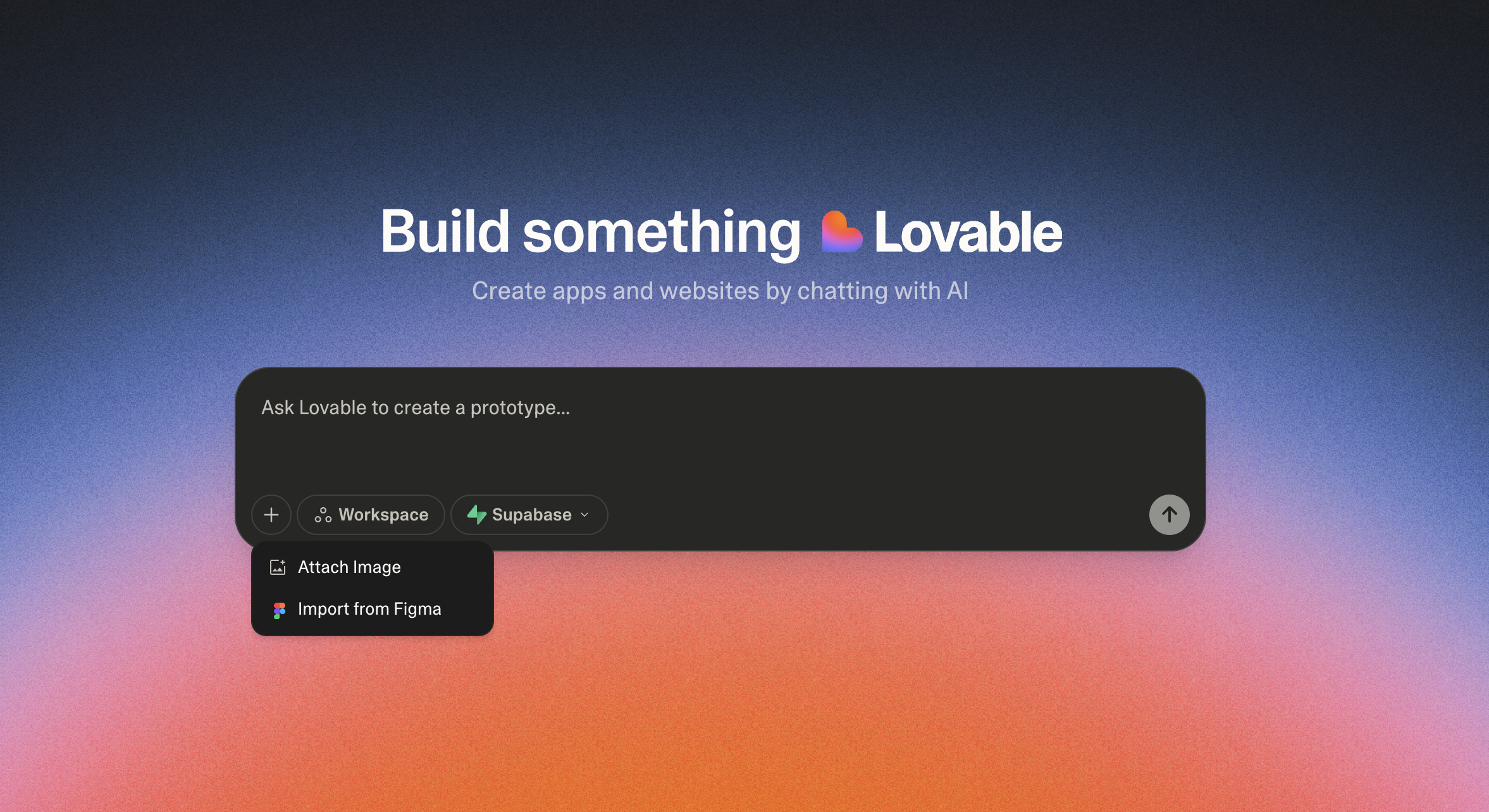
With Lovable, you have the ability to design websites and develop straightforward business tools by utilizing a prompt, whether it’s text, an image, or even a Figma file.
I like the integration with Supabase for database storage, the support for GitHub, and the ability to publish your site to a custom domain.
Compared to Bolt.new (which I covered in the previous issue), Lovable currently wins in terms of ease of publishing websites. That said, Stripe payment integration feels a bit more intuitive in Bolt.new.
💡 Want to learn how to design user-friendly digital services? Feel free to join our UX/UI and AI design course.
3. What are the advantages of Google’s Veo 3 model?
Veo 3 is Google’s latest AI video generation model – and it’s impressive: in addition to visuals, it automatically generates character speech and background audio when needed (see the example video above).
I currently access Veo 3 via Canva and Veed.io’s paid plans. Veed.io uses a credit system in its AI Playground. Canva allows up to five videos per month.
I also discovered that Gemini Pro, part of the business plan, includes video generation with a limit of three videos per day.
4. Why should you try Flowstep.ai?
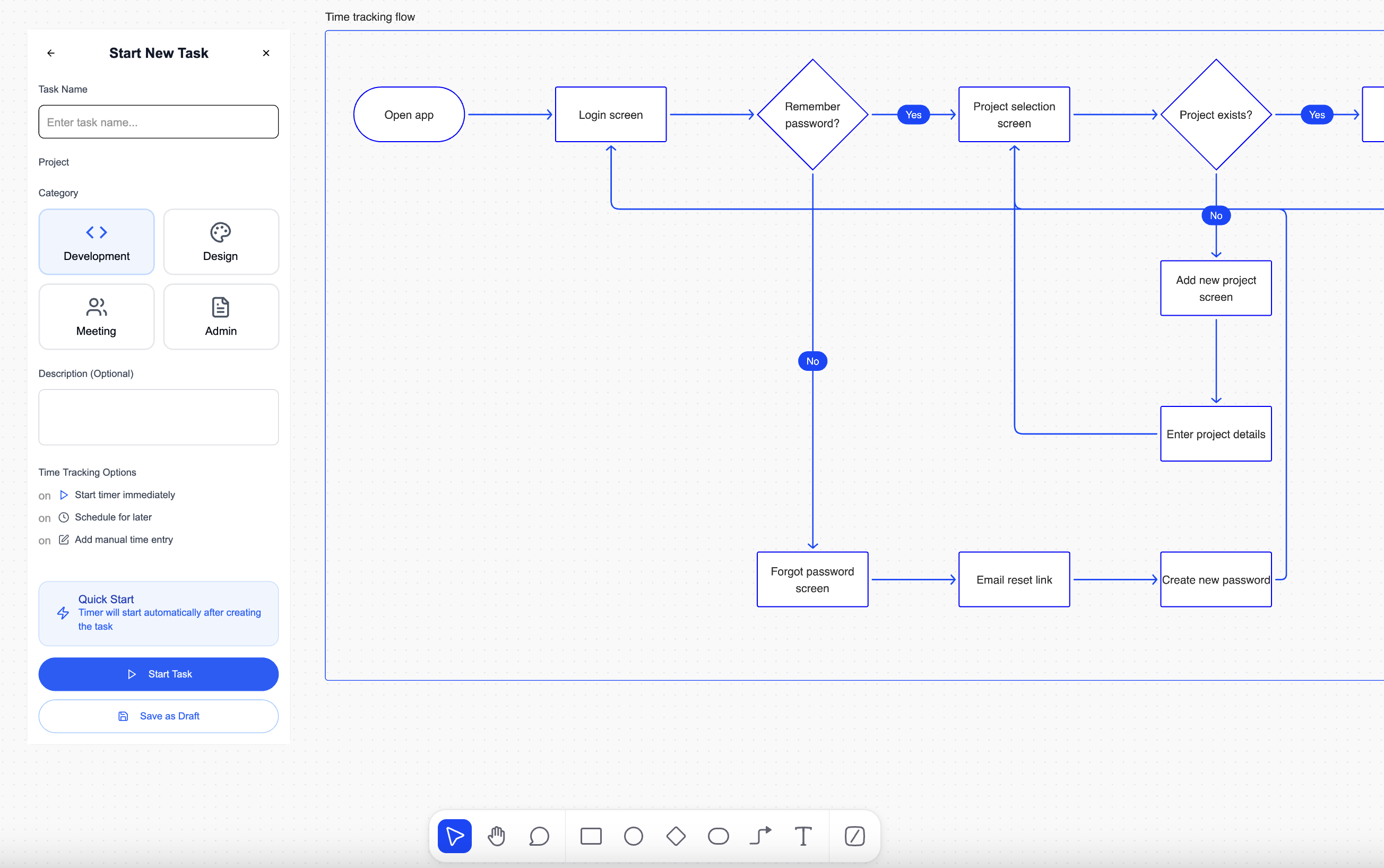
Flowstep.ai helps turn ideas into web and app designs. The startup has ties to Estonia and has also secured some funding from local angel investors.
Right now, Flowstep is still in the early stages, but you can already generate initial screen sketches through prompting. Additionally, you can create journey maps to outline key views prior to starting the design process.
A neat feature I like: the “Next screen” button, which uses AI magic to generate the next logical screen in your app flow.
Flowstep is currently free for everyone to use. Give it a go and drop some feedback for the team!
5. Can users skip straight to the content on your website?
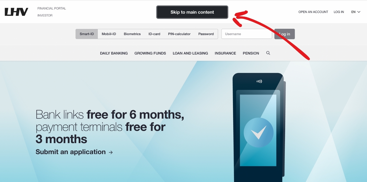
The “Skip to main content” link is a key accessibility feature. If keyboard users (yes – your site should work without a mouse) or screen reader users have to tab through dozens of repeated navigation links before reaching the content, frustration builds – and so does the risk of drop-off. 😔
This is the reason why a straightforward and impactful solution known as “Skip to main content” was created.
It typically appears only when users start navigating with a keyboard (e.g. by pressing the Tab key). It moves focus directly to the main content area, skipping menus and other repeated elements.
Why is this important?
- It helps screen reader and keyboard users get to content faster
- It reduces repeated navigation on every page
- It shows your website respects focus management
- It supports WCAG Success Criterion 2.4.1: Bypass Blocks
Is the “skip to content” feature working on your site? Try it: open your site, hit Tab-key on your keyboard. If nothing appears or it doesn’t skip to the content, it’s an easy but valuable fix your designers and developers can make.
👉 In previous newsletters, I have covered:
- What is a screen reader and how does it work?
- Why is alt text important?
- How does aria-label help ensure accessibility?
- Accessibility and text contrast – what should you know as a designer?
- Why should you try the Alt Text Generator AI assistant?
- What are the top accessibility issues on websites?
The Accessibility Act came into force last month, on June 28. If you’re not familiar with it yet – it’s a good time to dive in.
Thank you for reading the newsletter! 🙏 High five! 🙌